2 - Column Block
Description
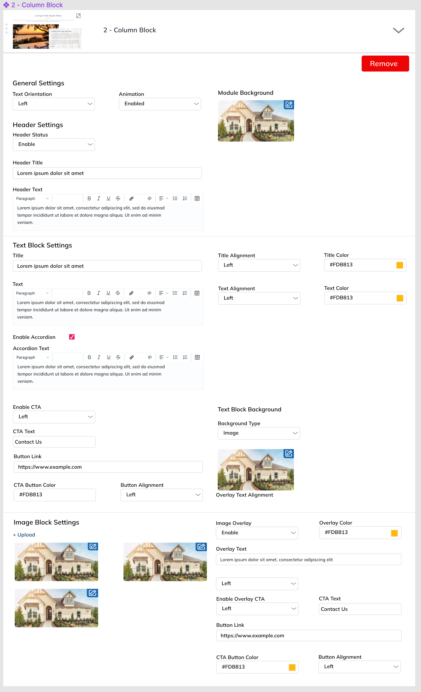
Fully customizable multi-functional block of 2 Columns and optional header.
Front-end design examples described HERE
General settings
Text Orientation: Left / Right Select on which side text block should appear, Left of the image block or on the right of the image block. Default: right.
Animation: Enable / Disable
Block background:
- White background (none)
- Image Upload (full screen width)
Header Settings:
User can edit these parameters of header:
- Header: Enable / Disable
- Header TitleIf Header exists - add horizontal divider.
- Header Rich Text
Text Block
Text Block overlaps image block. There’s optional animation. If Animation enabled: 2 blocks are rolling in to the page from the opposite screen edges. Examples here: https://www.brightlandhomes.com/about-us/careers
Text Block settings:
Title
- Text
- Color
- Title Horizontal Align
Text Content
- Rich Text
- Accordion Checkbox (shows “Expanded Text” menu)
- Expanded text content (styling inherits “Rich Text” styling.
- Accordion Checkbox (shows “Expanded Text” menu)
- Text Color
- Text Horizontal Align
- Rich Text
CTA
- Enable / Disable
- Text
- Text color
- CTA Color
- Link
- Horizontal Align
Text Background
- Image
- Overlay Color
- White
- Blue
Image Column:
User can upload one or more images.
If one - Display the image
If >1 - Slideshow (5 sec. delay)
If sleceted Text overlay - image settings are tha same but adds overlay on top of image.
- Text Overlay:
- Optional Image upload
- Rich Text Content
- Text Color
- Text Background
- Image
- Overlay Color
- White
- Blue
- Text Align
- Optional CTA
- Text
- URL
- Align
- Text color
- CTA Color
Design